“You can’t manage what you can’t measure”
This quote from management guru Peter Drucker is not actually true.
We manage a whole host of things that are difficult, if not impossible, to quantify – the effectiveness of a lot of training is a pertinent example – but this statement is more applicable to the engineering discipline than in many other fields of endeavour.
However, we have to face an additional challenge in the world of Support Engineering; in that many of our measures are probabilistic (or stochastic if you prefer). To illustrate, we cannot predict when equipment will fail; we can only estimate the probability of failure within a given time frame.
One consequence of this probabilistic nature is that the metrics can mislead the unwary; they are not well understood.
This paper aims to make the reader aware of the nature of these metrics and explain some of the underlying principles in accessible layman’s terms.
An illustration
During Aspire’s LSA training courses, we ask the delegates to consider the following, and to answer the question at the end:
-
- We place 1,000 display screens in a temperature and humidity-controlled environment and switch them on.
- The screens have a Mean Time Between Failure – an MTBF – of 760 hours.
- If we return after 760 hours – what percentage of the screens will still be working?
Occasionally someone knows the correct answer, but normally we receive the following responses:
-
- 10%
- 50%
- 90%
Considering the information given, these are all wrong – the answer is 37%.
There are some things to consider here, firstly 37% is not an ‘intuitive’ answer – this article started by stating that the metrics can be misleading…
The incorrect answers above are ‘intuitive’ however.
The people stating 10% are thinking that the MTBF has been reached, so the screens should have failed, but a few will have survived. So rather than saying 0% they back off a little and offer 10%.

The people stating 50% are visualising the “Normal Distribution” and hence they are assuming that about half of the screens will have failed and half will have survived.
The people stating 90% are thinking that the MTBF has only just been reached, so the screens should have survived, but a few will have failed. So rather than saying 100%, they back off a little and offer 90%.
We should note here that the very large ‘sample’ size of 1,000 screens means that there will be very little “statistical variation” in the result, that is, if we repeat the experiment a number of times, the answer will always be 37% – or very near to it.
The question I have to answer now is, why? Why is the answer 37%?
Before we answer that let’s take a step back and understand the metric at the centre of this discussion “Mean Time Between Failure” – MTBF.
The bathtub curve and MTBF
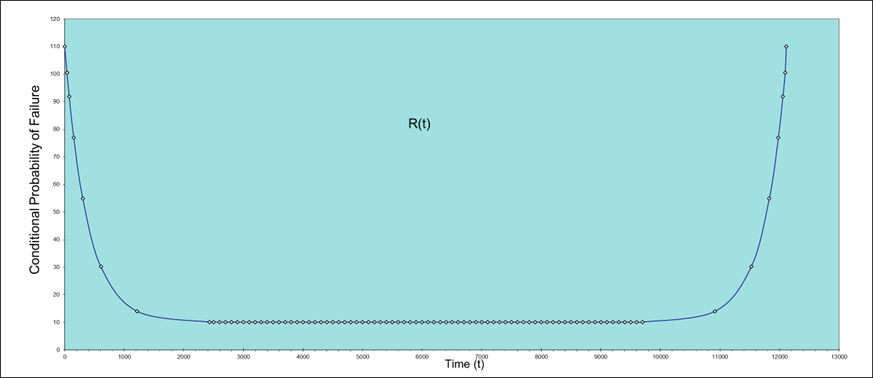
The diagram above shows the “Bathtub Curve,” which will be well known to many. For the uninitiated, however, this is a chart that shows how reliability or, more accurately, the probability of failure, changes over time.
Early in an equipment’s life cycle, it may demonstrate “Infant Mortality”, which is a relatively high failure rate due to manufacturing errors, variance in the quality of materials, etc. The failure rate decreases as these issues are resolved.
During the latter stages of an equipment’s life cycle, it may demonstrate “Wear Out,” that is an increase in the failure rate as wear and tear over the equipment’s life cycle take their toll.
In between these two extremes the assumption is that the failure rate remains more or less constant.
(Note, however, that this pattern does not apply to all technologies. For example, many technologies do not demonstrate a period of Infant Mortality, whilst others do not have a constant failure rate.)
The lower the MTBF, the greater the Failure Rate, and the greater Failure rate, the greater the Probability of Failure will be. We can determine the mean “Probability of Failure”(and hence a mean Failure Rate and MTBF) from the data that underpins a Bathtub curve; just such a “mean” is shown by the red line on the bathtub curve chart below. Similarly, we could, mathematically, determine the MTBF for the entire life of the equipment.
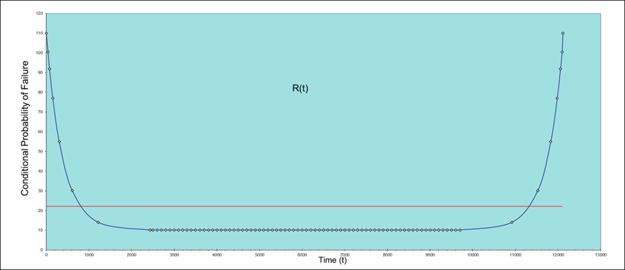
The problem is that such a mean doesn’t have much utility – it tells us nothing useful about any of the three phases of the equipment’s life, i.e. the periods when Infant Mortality, Constant Failure Rate and Wear Out periods.
In practical terms, the MTBF is only applicable to the centre part of the curve, as illustrated below.
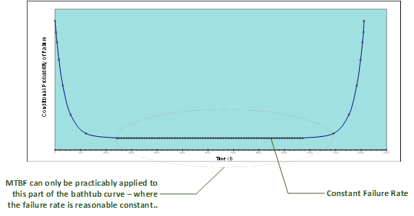
As a result, we associate MTBF with “Constant Failure Rate”.
MTBF and the exponential distribution
The next step in our explanation is to relate MTBF to the Exponential Distribution.
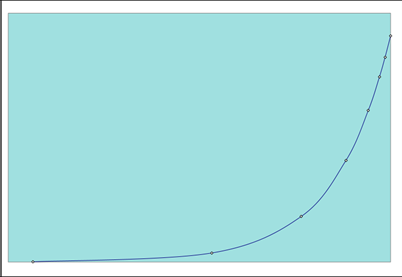
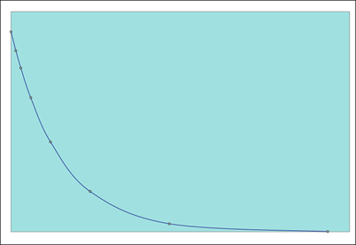
Images of two exponential distributions are shown below, the first shows exponential ‘growth’ and the second exponential ‘decay’.
It should be noted that these curves are not related to the Infant Mortality or Wear Out elements of the Bathtub Curve which show how reliability (probability of failure) changes over time. Growth Rate curves such as the example below are used, for example, to show how bacteria multiply over time and Decay Rate curves are used, amongst many other things, to show how the radioactivity of a radioactive substance decays over time; they can be used to determine the ‘half-life’ of a radioactive substance.
We will be mostly concerned with exponential decay because we are interested in how things fail.
But we now need to understand the relationship between “Constant Failure Rate” and the “Exponential Distribution”.
Let’s take another, brief, step back and consider some very basic probability mathematics, as applicable to tossing a coin.
Remember:
When tossing a coin the probability of a throwing a ‘Head’ = 0.5
This is constant, the probability never changes – it is constant no matter how many times you flip the coin, no matter how many heads you have thrown previously.
But the probability of throwing two heads consecutively = 0.5. x 0.5 = 0.25
That is the probability of throwing a head on the first throw times the probability of throwing a head on the second throw. Alternatively, this can be presented as (0.5)2. We can extend this approach; for example, the probability of throwing five heads consecutively is (0.5)5 = 0.03125, and eight times is (0.5)8 = 0.00390625 and so on.
We can apply the same basic principles to reliability and MTBF and create a chart of “Probability of Survival” over time – this is written as R(t) – where “R” = probability of Survival and the “t” indicates over time (as opposed to cycles for example).
Let’s use our presentation screens to illustrate this.
We can safely assume that the probability of survival for an infinitesimally short period of time is 100%, which gives us our first point on the chart.
Let’s, for the sake of this illustration, assume that we have some robust data and that the probability of surviving for 38 hours is 95%, this gives us our second point on our chart.
With this information, and using the coin tossing example above, we can calculate the probability of surviving for 76 hours (i.e. two 38 hour periods) – this is the probability of surviving for one 38 hour period times the probability of surviving for a second 38 hour period, i.e. 0.95 x 0.95 = 0.9025
We can repeat this process now as follows: we can calculate the probability of surviving for 152 hours (i.e. two 76 hour periods) – this is the probability of surviving for one 76 hour period times the probability of surviving for a second 76 hour period, i.e. 0.9025 x 0.9025= 0.8145. And so on for each doubling of time ‘t’.
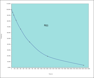
If we do this, we will end up with a set of data and a chart that looks like the one below.
Time (Hours)
0
38
76
152
304
608
1216
2432
R(t)
100.00%
95.00%
90.25%
81.45%
66.34%
44.01%
19.37%
3.75%
This is clearly an exponential decay – and if we look at the data more closely – if we place a cursor on the curve at the point where t = 760 (=the MTBF of the displays) and read off the results on the probability axis, we can see that the result is 37%.
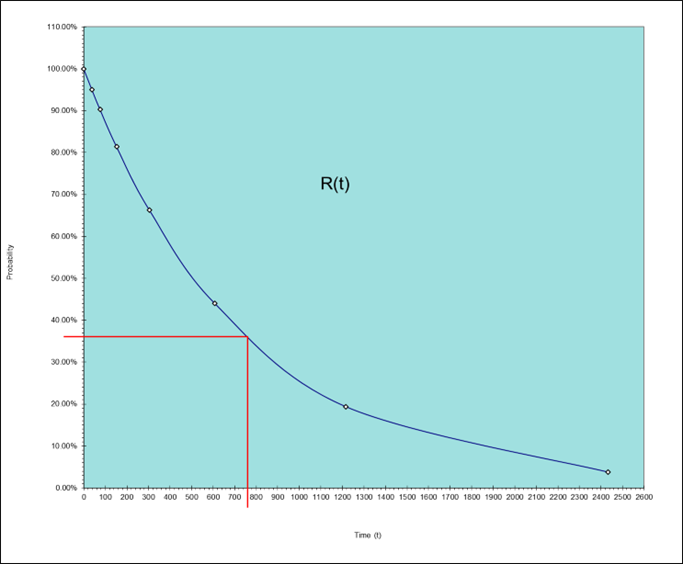
We will get the same result no matter what value of MTBF we use, the gradient of the curve will change, but the probability of survival where time ‘t’ = the MTBF will always be 37%.
But we can use “Euler’s” number ‘e’ to obtain the same result using the formulae R(t) = e-λt
Where R(t) is the probability of survival for time t;
λ is the failure rate (which = 1/MTBF).
Note: e -λt = 1/eλt.
eλt being the formulae for exponential growth and its inverse, 1/eλt or e-λt as it is more commonly written, being the formulae for exponential decay.
Now if we substitute our original values into the decay version of this formulae then we get:-
R(t) = e-1/MTBF x t =
R(t) = e-1/760 x 760 =
R(t) = e-1
= 0.367879441171…
Which we can round up to 0.37 or 37%.
We can use Excel for these calculations – the Function “EXP” will return ‘e’ raised to a given number.
The next question we need to address is “What is Euler’s Number e; and where does it come from? We’ll deal with that in Part 2.

About the Author
Peter has been involved in Defence support for all of his working life, initially in the Army and then as a specialist in Supportability Engineering.
He has extensive experience as a lecturer and trainer in Supportability Engineering; he has been actively engaged in the development and training of US and UK Defence Standards, including ASD S-Series specifications.
As an Army veteran, Peter served in the UK, Canada (BATUS), and Germany maintaining Army and Commando aircraft, he has operated on land and at sea, having deployed on Royal Navy [RN] and Royal Fleet Auxiliary [RFA] vessels.
Connect with Peter on LinkedIn

About Aspire
What does Aspire do? Almost every organisation on the planet uses equipment to deliver its service. Very few are always
happy with the performance of that equipment. We train, guide and
collaborate with organisations to design support solutions that keep
equipment performing, so they can deliver their service, consistently and
effectively.
Follow Aspire on LinkedIn

