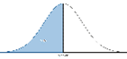
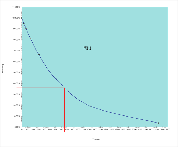
The people stating 50% are visualising the “Normal Distribution” and hence they are assuming that about half of the screens will have failed and half will have survived.
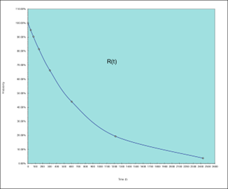
Time (Hours)
0
38
76
152
304
608
1216
2432
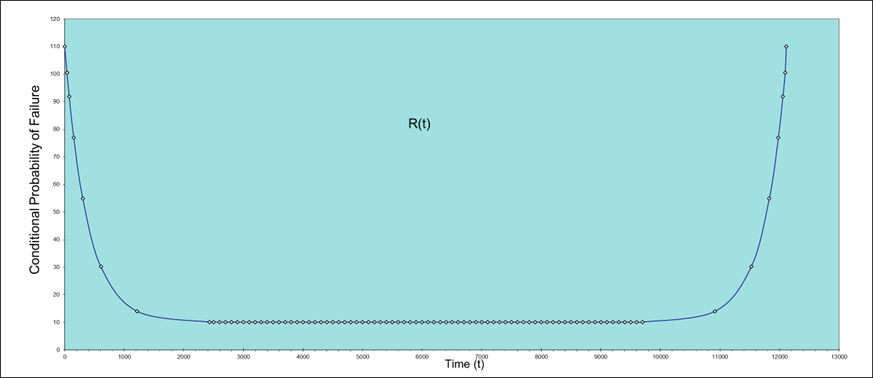
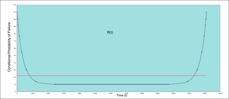
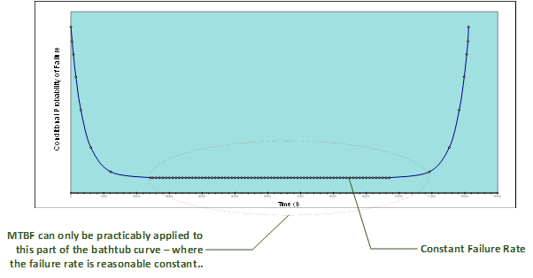
R(t)
100.00%
95.00%
90.25%
81.45%
66.34%
44.01%
19.37%
3.75%

About the Author
Peter has been involved in Defence support for all of his working life, initially in the Army and then as a specialist in Supportability Engineering.
He has extensive experience as a lecturer and trainer in Supportability Engineering; he has been actively engaged in the development and training of US and UK Defence Standards, including ASD S-Series specifications.
As an Army veteran, Peter served in the UK, Canada (BATUS), and Germany maintaining Army and Commando aircraft, he has operated on land and at sea, having deployed on Royal Navy [RN] and Royal Fleet Auxiliary [RFA] vessels.
Connect with Peter on LinkedIn

About Aspire
What does Aspire do? Almost every organisation on the planet uses equipment to deliver its service. Very few are always
happy with the performance of that equipment. We train, guide and
collaborate with organisations to design support solutions that keep
equipment performing, so they can deliver their service, consistently and
effectively.
Follow Aspire on LinkedIn